environmental Signage System
OGCC Facility Signage
A coordinated signage system that extends an established brand across a golf and country club environment.
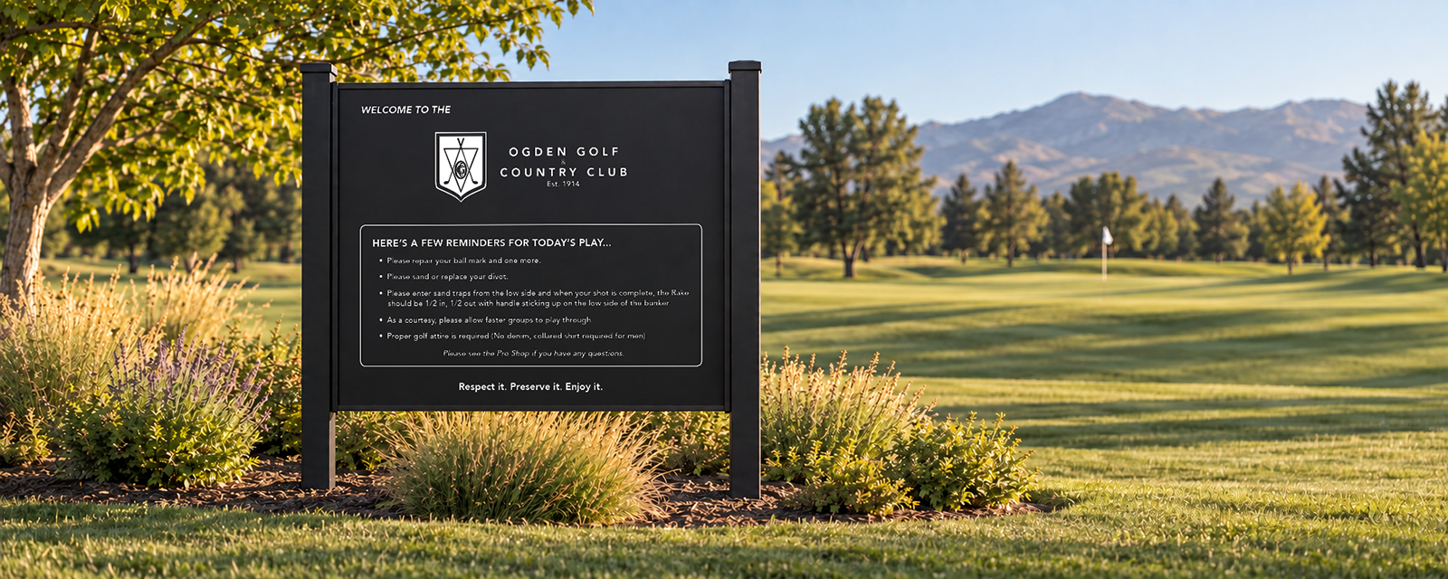
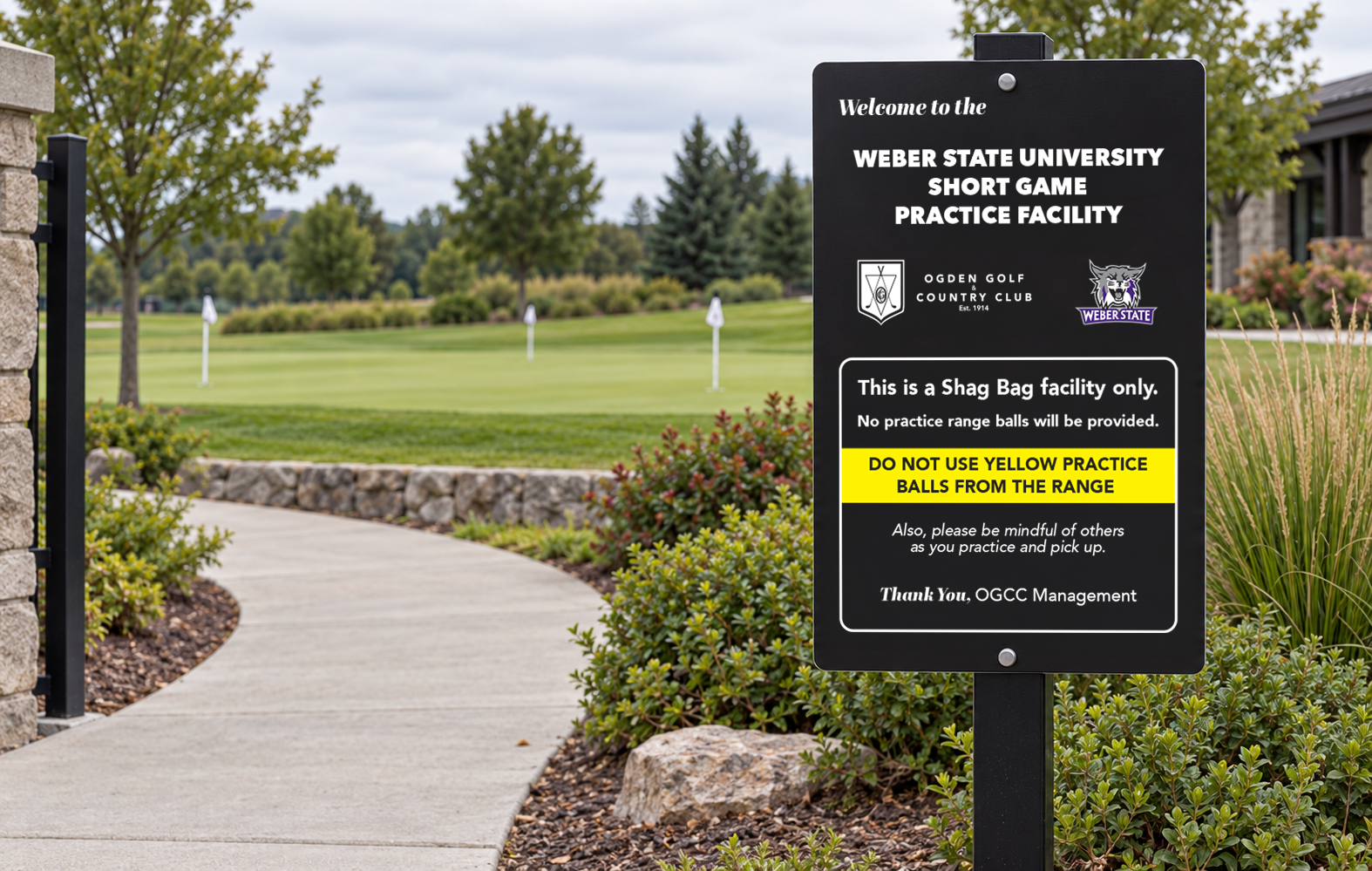
This signage system was created for Ogden Golf & Country Club and included member and guest instructions, course safety messaging, range rules, facility identification, and signage for the Weber State University Short Game Practice Facility. The designs organize detailed information into clear, durable formats while maintaining a consistent visual relationship between OGCC and Weber State Athletics.

MY ROLE
Designer responsible for layout, brand adaptation, information organization, and production preparation. Each new sign was designed to complement the club’s existing signage, creating a cohesive look throughout the facility while remaining consistent with its established branding.
DELIVERABLES
Welcome signage • Policy signage • Range map • Facility identification • Range rules • Safety and instructional signage
CLIENT
Ogden Golf & Country Club | ogdencountryclub.com
TOOLS / PRODUCTION
Adobe Illustrator, Adobe Photoshop, Adobe InDesign, and Google Maps. The signs were prepared for durable exterior production and were produced on aluminum composite material.


From Aerial Reference to Illustrated Wayfinding
Using aerial imagery and notes supplied by the client, I mapped the practice area’s greens, bunkers, trees, pathways, tee positions, and yardages. I then translated that information into a simplified illustrated map that golfers could understand quickly while using the facility.


One Policy, Two Touchpoints
The Errant Golf Ball Policy was adapted for two different environments: an 8.5 × 11 notice mounted inside golf carts and a larger 14 × 18 sign positioned along the course. Both applications maintain the same hierarchy and message while responding to different viewing distances and installation needs.



Design Approach or Production Considerations
Because the signs served different purposes and appeared in different areas of the facility, each design needed to prioritize the appropriate information while still feeling like part of the same system. I adapted the club’s existing visual language across different orientations, content types, and viewing situations, with an emphasis on clear hierarchy and outdoor legibility.